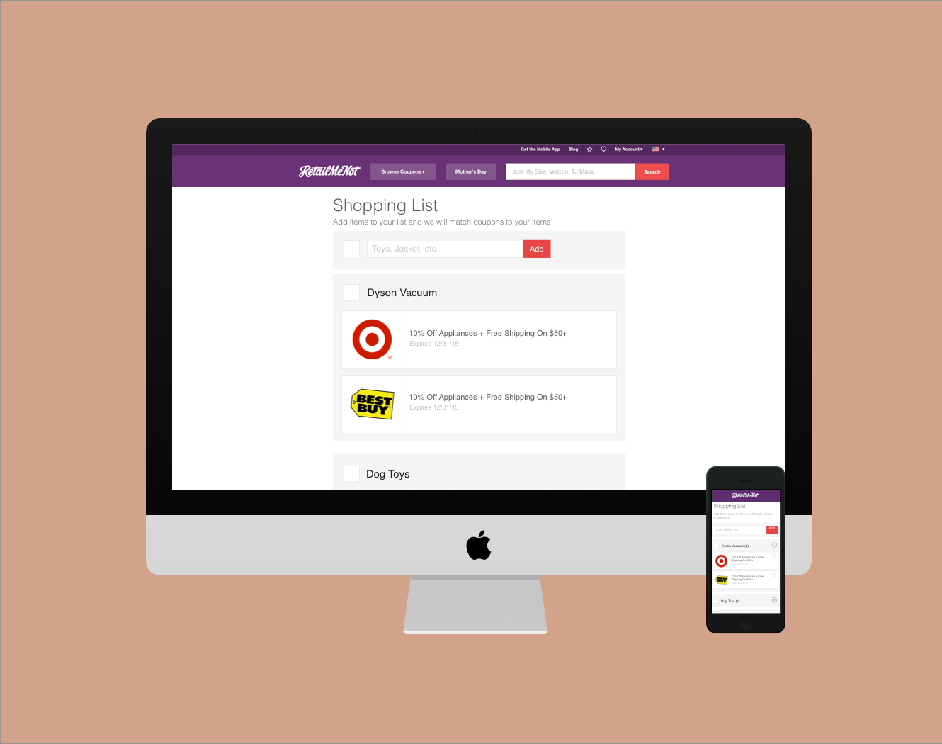
RMN Shopping List

The Challenge: Design a shopping list product for RetailMeNot. Users must be able to add a product to the list and RMN will then provide coupons for the items added to the list.

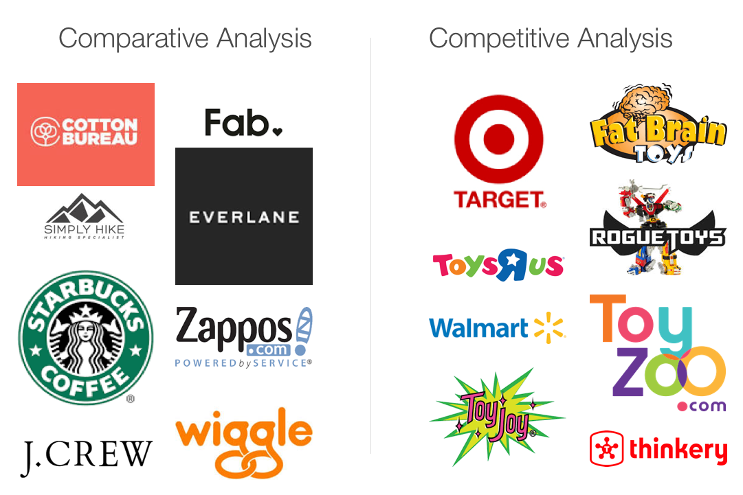
The Process:  Sketching, Competitive and Comparative Analysis, Feature Prioritization, User Flows, Wireframes, Digital Interactive Prototypes, Usability Testing

My Role:  UX and UI Designer

My Team:  Anna Hofmanova (UI Designer), Jim Thomas (Design Manager)

Deliverables:  Designs and assets for iOS and Android on Desktop, Tablet and Mobile

Tools: Sketch, Invision 


THE PROCESS

Documentation and Feature Prioritization 

User flows exploring where/when to gate the shopping list

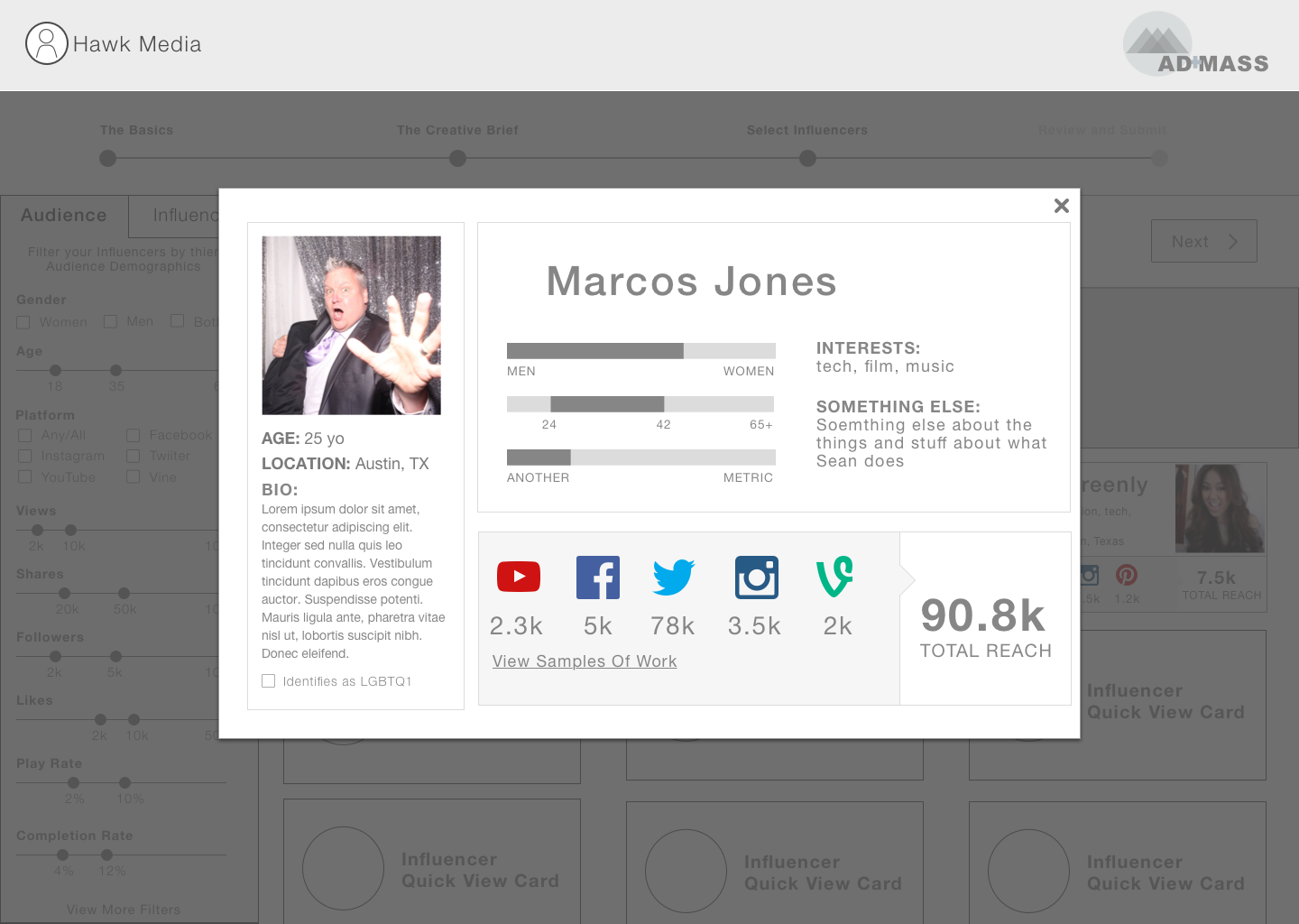
A high level overview of wireframes for the 4 prototypes I built to test in usability.

A few key screens of the mobile version of RMN Shopping List

Page one of the Usability Test Plan

Page one of the Usability Test Plan

Usability Testing

RetailMeNot works with a third party for usability testing. Because we wanted to test two versions for both desktop and mobile we had to be strategic with the 60 min usability session. There were two main objectives for this test; to determine the value of this product to RetailMeNot users and to understand which of the two versions would resonate more with users and why. After a full day of watching usability testing we debriefed and determined to move forward with a hybrid version, taking the most successful features and flows from each prototype. 


RMN Weekly Ads Landing Page

The Challenge:  Create a destination for RetailMeNot desktop and mobile app where users can browse all of RetailMeNot’s weekly ads, circulars or Lookbooks. 

The Process:  Worked with Product Manager to understand product specs and business goals. Considered the RMN brand and user to come up with a clean and easy to navigate destination where all weekly ad content can live. Beginning with competitive analysis and sketches, then moving to wireframes and ultimately high fidelity mocks. Lastly I redlined all mocks for the engineers to work from. Keeping in mind the product must also be responsive, as it will live on the RMN site, I made versions for mobile, tablet and desktop. Designed for both iOS and Android. 

My Role:  UX and UI Designer

Deliverables:  Designs and assets for iOS and Android on Desktop, Tablet and Mobile

Tools: Sketch

Versions of the landing page in sketch

Redlines for iOS Mobile

Setting Your Location

LBJ Presidential library & museum is reconceptualizing connecting with millennials. 

Since it’s opening in 1971, the mission of the Lyndon B. Johnson Presidential Library and Museum has been "to preserve and protect the historical materials in the collections of the library and make them readily accessible; to increase public awareness of the American experience through relevant exhibitions and educational programs; to advance the LBJ Library's standing as a center for intellectual activity and community leadership while meeting the challenges of a changing world.”

The museum currently draws audiences with its permanent exhibits on the transition of power from Kennedy to Johnson, the Vietnam War, the Civil Rights Movement, and Johnson’s life in the White House, along with temporary exhibits. Approximately 100,000 visitors from around the world visit the LBJ Library exhibits each year.


The Challenge:  Considering the large number of young people visiting and moving to Austin, the LBJ Presidential Library and Museum aspires to increase their appeal to the millennial audience, not through temporary exhibits buy by enhancing their permanent exhibits. (Note: this project was assigned by General Assembly)

Our Solution: Create an interactive app that uses beacon technology to deliver location specific content through faux social media accounts. The App delivers easily digestible bits of information in a way that is familiar and natural to millennials.  App users can easily share, tweet and post their LBJ experience, which is also a great way to promote and generate buzz for the exhibits at the LBJ Presidential Library and Museum.

Timeframe:  2 Weeks

Tools:  Sketch, InVision

Team:  Caitlin, Chris & Greg

My Role:  Project Manager, UX/UI Designer


project planning


research and discovery


We started this project by diving into a wide range of research topics. It was important to have a good understanding of not only our target demographic but several categories such as tech industry trends and Austin tourist attractions. Having a pulse on a range of related topics helped us identify an obtainable solution for the LBJ Presidential Library and Museum.

Areas of research we focused on:

  • Millennial research
  • Millennials and museums
  • Museum trends (American Alliance of Museums)
  • The "Experience Economy" 
  • Presidential Library websites and exhibits
  • Articles written about Presidential Libraries 
  • Austin tourist attractions
  • Austin museums and galleries
  • Technology trends

sketching and IDEAtion


developing personas

We started by creating three proto-personas. Once we visited the LBJ Library and Museum to gather more information we were able to further develop our personas. Click to enlarge and read full details.


contextual inquiry

It was crucial that we visit the LBJ Library and Museum, by doing so we were able to observe and interview museum visitors, volunteers and employees. We were lucky enough to interview the museum curator, Michael MacDonald. Michael provided helpful insights that we heavily considered while coming up with our ultimate solution.


the solution

Create an app that uses beacon technology to deliver curated faux social media posts that coincide with the museum's physical exhibits. This solution would re-contextualize content and redefine the visitor experience in a way which is dynamic, engaging and resonates with millennials.

  • What—A location-based technology which allows mobile apps to deliver highly curated messages/content when the user is within range of a beacon. This is all done via bluetooth. 

  • Why—We wanted to create an experience that would resonate with millennials and allow them to consume digestible pieces of history as if it were happening with the technological capabilities of today.

  • How—The Museum would provide the physical beacons and exhibit content. Once everything is set the technology does the rest! This technology lends itself to data mining which would allow the museum to identify any engagement issues and act accordingly while content is updated or changed easily and quickly.


feature prioritization and mvp

Once we had a solution, we had several ideas for features to include in the app. It was important for us to take a step back and prioritize what we would be able to accomplish in the 2 week timeline and consider what the Minimum Viable Product would look like. Using the "Moscow" method we plotted features on a graph to determine the most necessary features for the app MVP.


usability testing

We used our paper prototype to test the flow and the faux social media content. We received great feedback and suggestions. One usability insight, regarding the 60's Pop Culture exhibit, gave the user accessibility to all quiz results instead of only their personal quiz result. Providing access to all quiz content promotes further exploration and engagement throughout the exhibit.


wireframes

A few key wireframes for the app.


future iterations might include

  • Develop a "School Tour" and "Build Your Own Tour" 
  • Revisit gamification aspect, how can we make this more clear and engaging—especially for students/school tour
  •  Expand "Explore More" page—include all social media accounts? link to another page or app? etc. 
  • Consider: how do we keep this app on users phones after they leave the exhibit?
  • Capitalize on data mining and insights

ADMASS is revolutionizing word-of-mouth marketing in the digital age.  

AdMass takes a data-driven approach to help advertisers connect to their advocates based upon the advocate’s affinity to the brand and the audience they reach. They leverage machine learning to enable efficient and scalable influencer marketing by solving the three main problems facing advertisers: finding the right influencers, pricing and engaging with influencers, and measuring ROI.


The Challenge:  AdMass has been in operation for 2+ years and is looking to pivot and reevaluate. They challenged us to redesign how advertisers and influencers interact with their system. This was a huge opportunity because we were helping to define the competitive advantage and the heart of their product. Focusing solely on redesigning the dashboard, campaign creation flow, and search engine allowed us to make granular decisions that directly impact the relationships between the advertisers and the influencers. 

Timeframe:  3 Weeks

Tools:  Sketch, InVision

Team:  Caitlin & Stephanie

My Role:  Project Manager, UX/UI Designer


project planning


research and discovery

After familiarizing ourselves with the project brief we began to prepare for our client interview by means of affinity mapping. We wrote down any questions, topics, etc. that came to mind on post-its. Once we felt that we had identified everything we grouped our post-its into themes which helped us determine a long list of questions and topics to review with our clients.


developing personas

It was important for us to refer back to both personas while creating the product to make sure each would be comfortable and successful creating a campaign and using the search engine. Mike's persona prompted us to add a brand tab on the dashboard—as most times agencies are dealing with multiple brands/accounts, each needing various campaigns.

Click Images to enlarge.


customer journey map

Every interaction a customer has with an organization has an effect on satisfaction, loyalty, and the bottom line. Plotting out a customer’s emotional landscape by way of a Customer Journey Map, or Experience Map, along their path sheds ­­­­light on key opportunities for deepening those relationships.
— UXmastery.com

sketching and ideation

Click sketches to enlarge and see more detail.


AN EXPLORATION IN FILTERS

AdmassFilters_01.png

The single most important feature in this redesign was the search engine — or finding/searching for the Influencers. We had to make it simple and efficient. In order to ensure it would deliver the best matches we looked how other content heavy sites used filters to help users find what they were looking for. After in-depth research we determined that using traditional filters with sliding scales would be the best approach. The sliding scales allow the advertiser to get really granular with their search, as they are not restricted to pre-determined content. We designed as many filter options as possible to use the sliding scale rather than radio buttons or check boxes. 


User Flows & dashboard map

Final dashboard map—click to enlarge


interviews and usability testing

I represent multiple clients and brands, I need something that will allow me to segment and organize all my campaigns easily and efficiently.
It is really hard to find influencers that promote the variety of brands I am representing, I need a large pool of influencers to choose from that spans across multiple verticals, not just fashion and beauty.
— David, Usability Test
While everyone wants less “spammy” ads, influencer marketing can also come across the wrong way if the message isn’t right. Usually, a good RFP form will outline exactly what the advertiser is looking for, but there are still times the content the influencer creates is just not up to par.

The need for an approval process needs to be easy. I don’t think the influencer has to necessarily send the advertiser the EXACT image or video they plan to post, but at least some sort of description what they plan to do so the advertiser has a chance to edit and provide feedback before the ad goes live.
— Pat, User Interview
You just don’t “click” on shopping cart and press purchase, there’s a review page, and I would definitely want to see something like that here
— Michael, Usability Test
Finding influencers is the fun part. I want to set up my work first and then search for them [influencers]. I don’t want to find them then—ugh—have to fill out a creative brief or do any more work.
— Keavy, Usability Test
I think quality of influencers can be on of good differentiators. Helping me to find the right influencer - yes, if it works well . Recommendations, for me, do not really resonates. ROI reports - yes, but I wouldn’t do my purchasing decision based on the reporting feature. Influencer advertising history/success stories/previous ROIs would be useful.
— Mary, User Interview

wireframes

A sample of the many wireframes created for the interactive prototype—click to enlarge.

selected annotated wireframes


Mike (our client), me and Stephanie (my partner)

Mike (our client), me and Stephanie (my partner)

Giving the final presentation to our clients

Giving the final presentation to our clients

the magic toy shop is embracing an e-commerce website.


The Challenge:  The Magic Toy Shop is a traditional brick and mortar toyshop that is growing quickly and looking to expand into the digital world. Considering the information provided in the project brief, create an e-commerce site for The Magic Toy Shop. (Note: This was a project given by General Assembly)

Timeframe:  2 weeks

Tools:  Sketch, InVision


project planning


A snapshot of the three personas

A snapshot of the three personas

UNDERSTANDING THE USER

The first thing I did for this project was dive into the (provided) user personas. I worked to identify common pain points and needs between John, Jasmine and Dexter.

This gave me a good idea of the primary areas of focus for the website design.

Through persona research I identified the following areas of focus:

  • account features
  • social validation
  • ease of use and discovery 

COMPARATIVE AND COMPETITIVE ANALYSIS

I used comparative and competitive analysis to help:

  • determine hierarchy of information
  • identify desirable account features
  • establish optimal user flows
  • gain inspiration for layouts

I also performed heuristic analysis on various toy retailer websites to familiarize myself with the navigation, task flows and shopping process.


Brands from comparative and competitive analysis 

Brands from comparative and competitive analysis 


Having some fun with the Toy Joy staff post interview!

Having some fun with the Toy Joy staff post interview!

field research

I visited a local toy store for general inspiration as well as to perform contextual inquiry and interview the employees.

One key take away was customers preferred to shop by age. This insight led to adding a "shop by age" tab on The Magic Toy Shop's global navigation as well as including it in filter options.


establishing categories

A list of 100 toys was provided. These toys needed to be grouped into categories for my global navigation.  I conducted multiple closed and open card sorts with fellow students, friends and family with the goal of establishing toy categories. My original idea was to condense categories and create subcategories—but after several card sorts it became clear that burying toys in vague categories was confusing to the user. Adding filters alleviated the need for subcategories. Filters also enabled the user to sort through products in the way that works best for them.


site map

Once my categories were established I worked to create a site map. Having a site map to refer to helped me while sketching user flows and layouts.


SKETCHING AND USER FLOWS

 Sketching helped me quickly identify areas of opportunity or confusion as well as explore alternative solutions.


testing and ideation

The Magic Toy Shop website evolved through multiple rounds of usability testing and design iterations. Some of the key changes were:

  • Removed filters on the product page to provide more space for product details, suggestions and recently viewed products 
  • Provided order status/history, the option to save personal information and offered reward points (in future iterations) and the ability create a wish list
  • Promoted staff and community favorites, recommendations and reviews on the homepage 
  • Offered phone and online chat assistance
  • Updated the check-out process, offered ability to save user information (if user has an account)
  • Evolved the product card to show product name, image, star rating, price and quick shop option

wireframes and prototype 

A sample of the wireframes created for the clickable prototype—click to enlarge


future iterations

  • Evolve the community page concept
  • Consider more customizable account features, flush out rewards points and wish list features
  • Revisit the details, update and maintain consistent and appropriate copy throughout the website

retailmenot digital production work

Duties Included—but not limited to:

  • Created assets for RetailMeNot digital products and marketing campaigns
  • Produced high fidelity mockups for internal and external use
  • Red-lined digital assets and handed off to PMs and Engineers
  • Built clickable interactve prototypes for usability sessions

Tools:  Sketch, Adobe Photoshop, Invision